
Seven Hills Running Shop

Overview
Scope: Website Redesign, Online Ordering Feature
My Role: Research, UX Design, UI Design
Tools Used: Figma, Maze, Optimal Workshop, Zoom

Defining the Problem
Heuristic Evaluation
To fully understand the pain points of the current site, I conducted a Heuristic Evaluation, where I evaluated the site based on the 10 Heuristics by Jakob Neilson. The site had various violations, but the three I will be focusing on are the three that have the largest impact on the usability of the site.


Aesthetic and Minimalist Design
“Aesthetically pleasing designs can provide memorable experiences that differentiate a brand. However, interfaces should only include necessary elements, with high informational value. Clarity will always win over visual flourish”
Neilson Norman Group
Design Inconsistencies
User Control and Freedom
“Users often make mistakes or change their minds. Allow them to exit a flow or undo their last action and go back to the system’s previous state”
Neilson Norman Group
Recognition Rather Than Recall
“Showing users things they can recognize improves usability over needing to recall items from scratch because the extra context helps users retrieve information from memory”
Neilson Norman Group


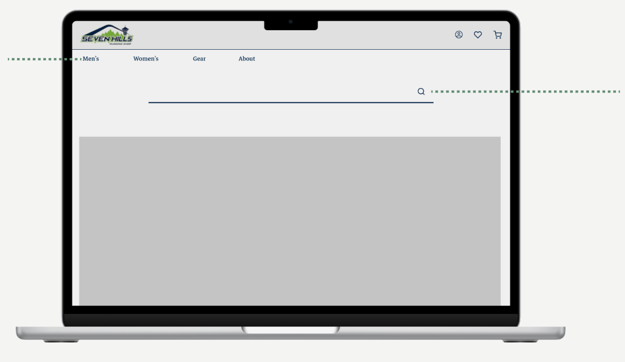
Lack of Visual Hierarchy
User Interview Takeaways
I virtually interviewed five users to gain insights on ecommerce shopping habits, preferences, and emotions. Afterwards, I wrote their insights on virtual sticky notes and organized them into groups based on commonalities.
Users want to know exactly what they’re buying.
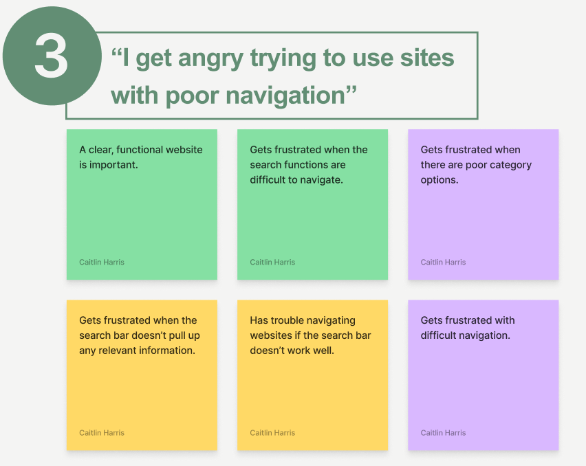
Users get frustrated with websites that have poor navigation.

How Might We…?
Before moving on to the initial designs, I took a moment to reflect on key insights gained from research to ensure I was designing based on user need:
How Might We maintain the integrity of the current brand?
Designing Solutions
Mid-Fidelity Wireframes
After the initial sketching phase, I created greyscale wireframes in Figma to showcase and test general layout and navigation:
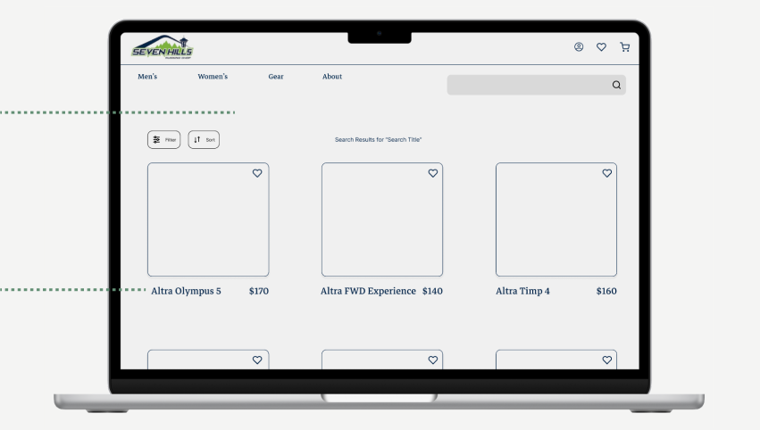
Personalized results based on search
Clear information about each product
Customer reviews, with ratings, descriptions, and photos
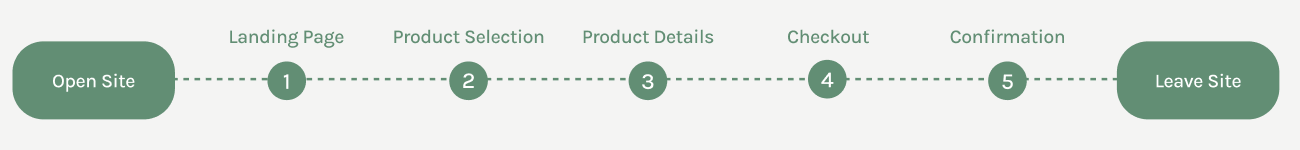
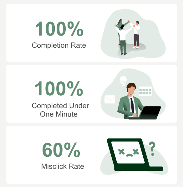
Usability Testing
After creating grey scale wireframes, I wanted to test and see how easy the redesigned site is to use and complete tasks.
Key Takeaways

The Result
Reflection
Proposed Next Steps
These are the parts of the product that would need to be prioritized if this project were to continue:
Lessons Learned
Problem Statement
Seven Hills Running Shop is a specialty running store located in Seattle, WA. Seven Hills has a dedicated staff who uses their extensive knowledge to provide the best service to their customers. However, their current website is a different story. Riddled with navigation and usability issues, customers have a hard time using the website to complete tasks.
In this project, I asked the question: How can the Seven Hills website be redesigned in a way that aligns with usability standards, and solves customer needs?
Analyzing the Data
How Might We clearly display details and reviews of each product?
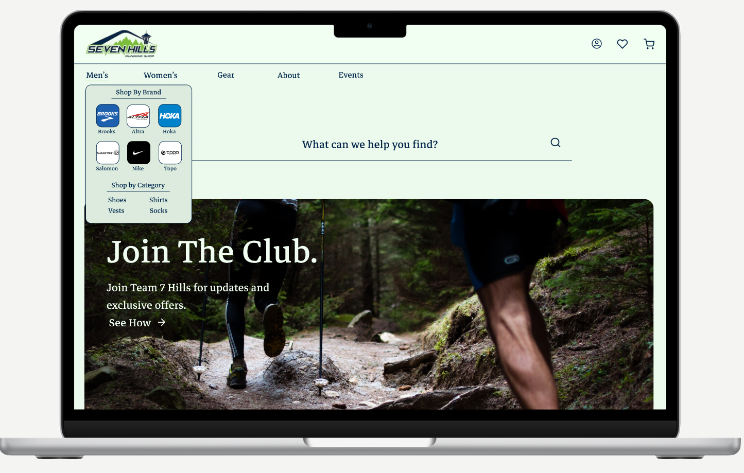
“My first thought was to go under the Men’s tab”


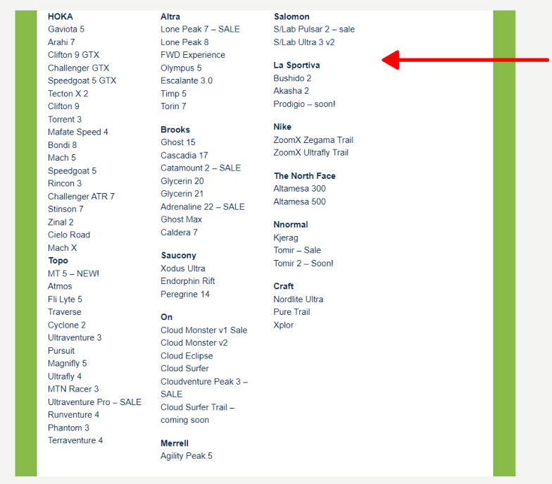
Cluttered Global Navigation
Clicking “Shop” takes the user to a different site, with no way to go back to the original page

Timeline: 2 Weeks
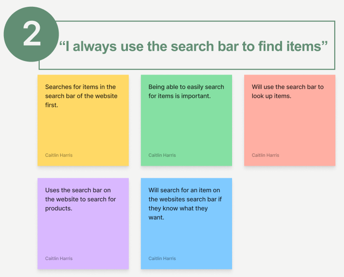
Users almost always use the search bar to find products.


Lacks essential product information for user clarity
Clear information about the product

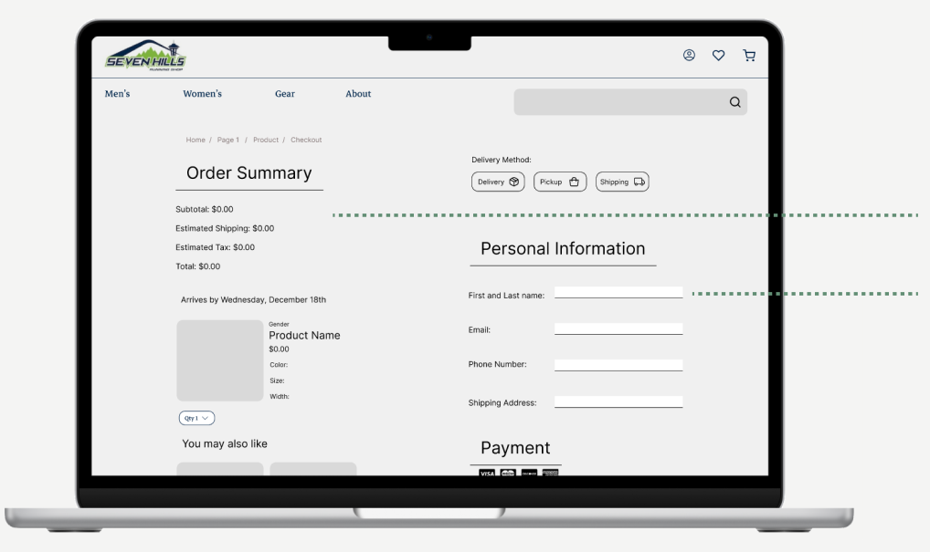
Clear display of what a user will pay
Keep Brand In Mind.
When designing for an existing product, the designer must always keep the company image in mind while designing. What is this brand trying to say? What are their values? Why did they make the design decisions that they did? All are important to build a great product.
Easy access to profile, saved items, and cart
Search bar is easy to access
All order information is imputed on the same page
Users wanted another way to look up the product.
Users didn’t understand the distinction between shipping and delivery.

High-Fidelity Wireframes
After gaining insights from usability testing, I made changes to the prototype and created a style guide that embodies the current brand of the company.
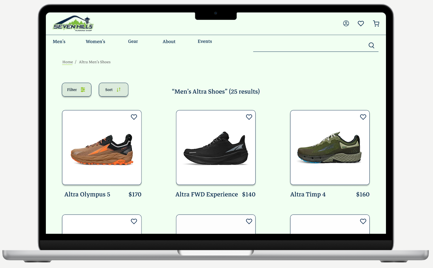
Product Discovery
Clear photos of each product
Breadcrumbs to signal to the user where they are and how to go backwards

Customer Reviews
Display of reviews via rating, description, and photo for other potential to see feedback on the product before they making a decision to buy.
Landing Page
Built out an alternative route to search for products.
Hero image that shows current benefits of shopping at Seven Hills
Product Description
Clear photo of the product at different angles
Clear depiction of variations available
Product ratings shown at the top of the screen

About Page
Clearly displays information about the store such as store hours, contact information, the return policy, and the stores history


Checkout Process
Consolidated “Shipping” and “Delivery” into one
Highlighted text fields to indicate they have been completed

How Might We build out filters to aid users in narrowing down their search?
How Might We showcase Seven Hills community events through their website?
How Might We explore the order pick up functionality of the website?
“The site shouldn’t rely on the search bar”
“I don’t understand what the difference between shipping and delivery is”
Always Seek Out Feedback.
Whether it’s from user interviews, usability testing, or just having someone look over your work, feedback is essential for good design. Feedback provides you with perspectives outside of your own and gets you out of your own head.